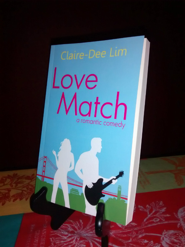
The proof copies of my novel Love Match arrived the other day. The delivered package had been unceremoniously set into a planter by the front door. I wasn’t aware it was there until a visiting friend pointed it out. I immediately tore into the box and beheld the proofs. After all the writing, rewriting and learning how to format the ebook and paperback (all of which I undertook myself), it was a surreal and exhilarating moment. But that feeling of accomplishment wore off quickly because I saw what wasn’t working in the proof copy.
CreateSpace Book Options
First, a few things about self-publishing with Amazon’s CreateSpace. Stylistic options are limited. You have the choice of a glossy or matte finish cover and cream or white interior paper. However, there are a variety of book sizes to choose from. CreateSpace provides templates to help you format your book with the right margins, gutters, headers and footers. The parameters can get a little complicated if you’re using lots of photos, drawings and creating oversized coffee-table type books. My book is simply text, so I only had to be mindful of correcting glaring orphans and widows. Text had to be condensed and expanded appropriately so it looked uniform and readable on the page. This was picky and time-consuming work. For an obsessive like me, I totally got into this process.
Physical Book vs. Digital Copy
The proof’s cover looked amazing. The colors were true and vibrant. The proportions of the artwork and design felt modern and in keeping with the tone of the story. The size was comfortable in my hand and it had the heft of well, a real book. I cracked it open. While the Garamond font was easy on the eyes and readable, the cream pages I had chosen felt wrong. I had also used a leaf as a section break. That looked weird too. This interior combo looked antiquated and off-kilter with my modern vibe. Reviewing the book’s digital copy was great for picking up oddball formatting issues. The hardcopy proof enabled me to see how all the elements worked together; I never would’ve known what worked and didn’t if I had just relied on the digital proof. So I’ll make some changes and generate another one. The lesson here is don’t skimp when it comes to ordering your proof. You don’t want any surprises when your book goes into production. Fortunately, they are inexpensive to produce.
How to Review Your Proof
In addition to considering the look and feel of your book proof, CreateSpace suggests you:
- Review your book three times, with each time focusing on a different aspect. If you try to review all of this information in one sitting, you could miss something.
- The first time: Check the format, including headers/footers, page numbers, spacing, table of contents and index.
- The second time: Review any images or graphics, and captions if applicable.
- The third time: Read the book for grammatical errors and/or typos.
- Get an objective perspective. Have someone unfamiliar with your book read it thoroughly.
Guess what I’m doing this weekend? More reviewing! The self-publishing journey continues.


Hey girl — so happy to’ve found your site. It looks great!! Would love to chat with you about making my ebook a real book! Will put that on my endless to-do list. xo S
Thanks, Shannon! Happy to help when you’re ready. Cheers!
Your book looks awesome Claire! Thanks for the helpful tips 🙂
Thanks, Layne! As you know very well, so much to digest with self-publishing.